I had the joy of designing the full stationery suite for my own wedding, including invitations, save-the-dates, menus, coasters, escort cards, table numbers, signage, and more. While print isn’t my usual medium, this was a rewarding challenge that let me explore illustration, typography, and physical interaction design. The goal was to create a cohesive, personal, and visually engaging experience for our guests—one that reflected a warm, intimate, and eclectic feel.
Design Goals
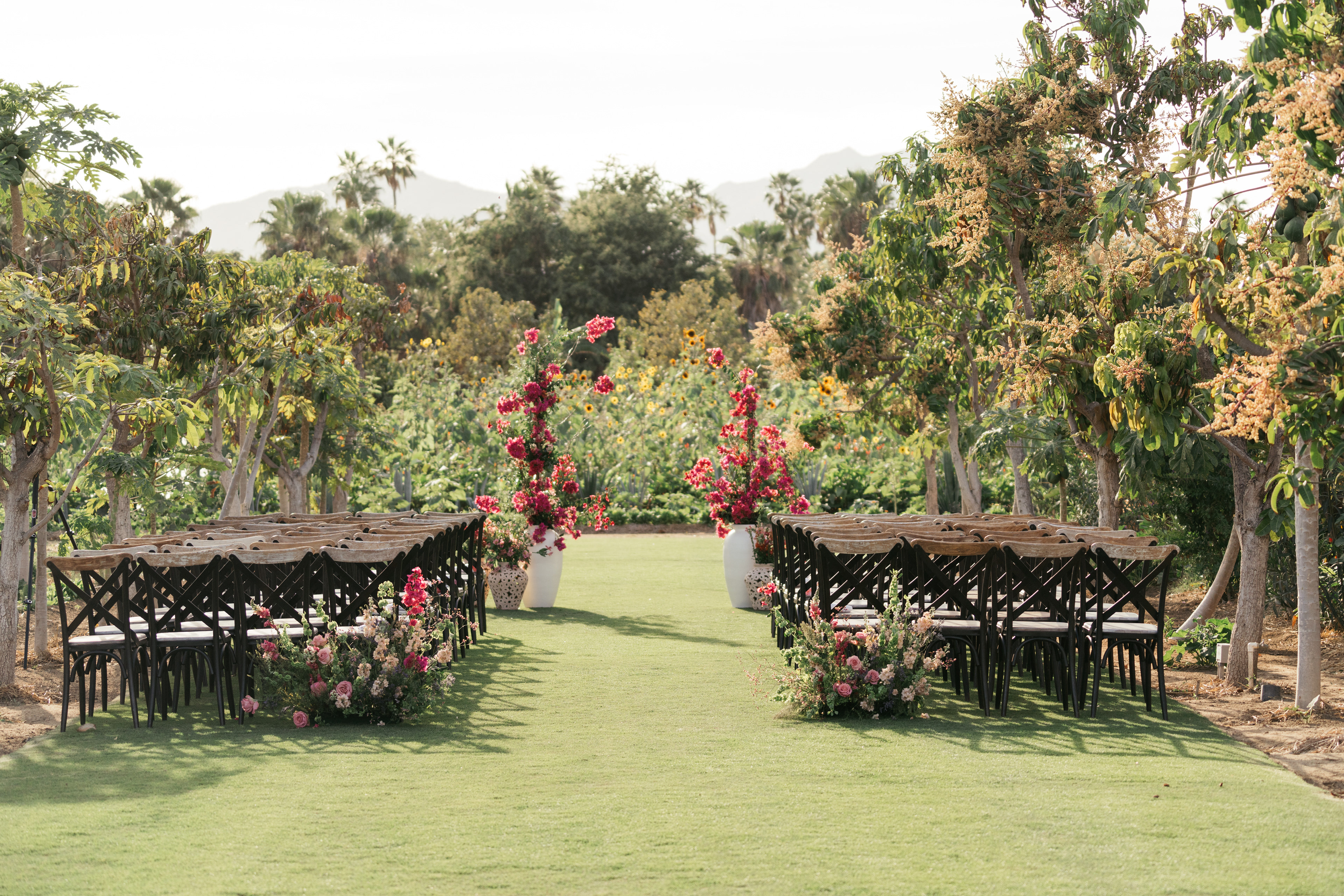
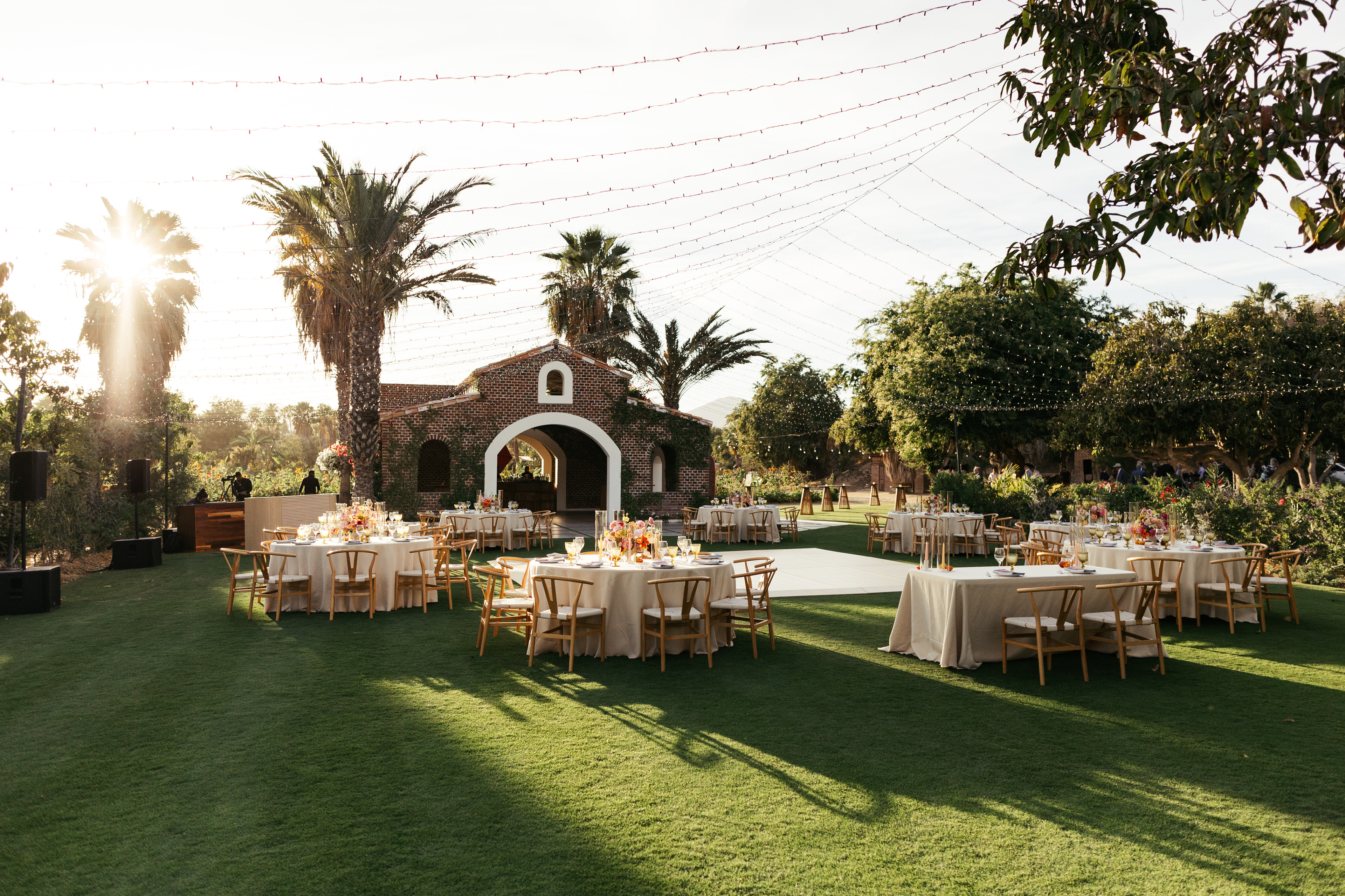
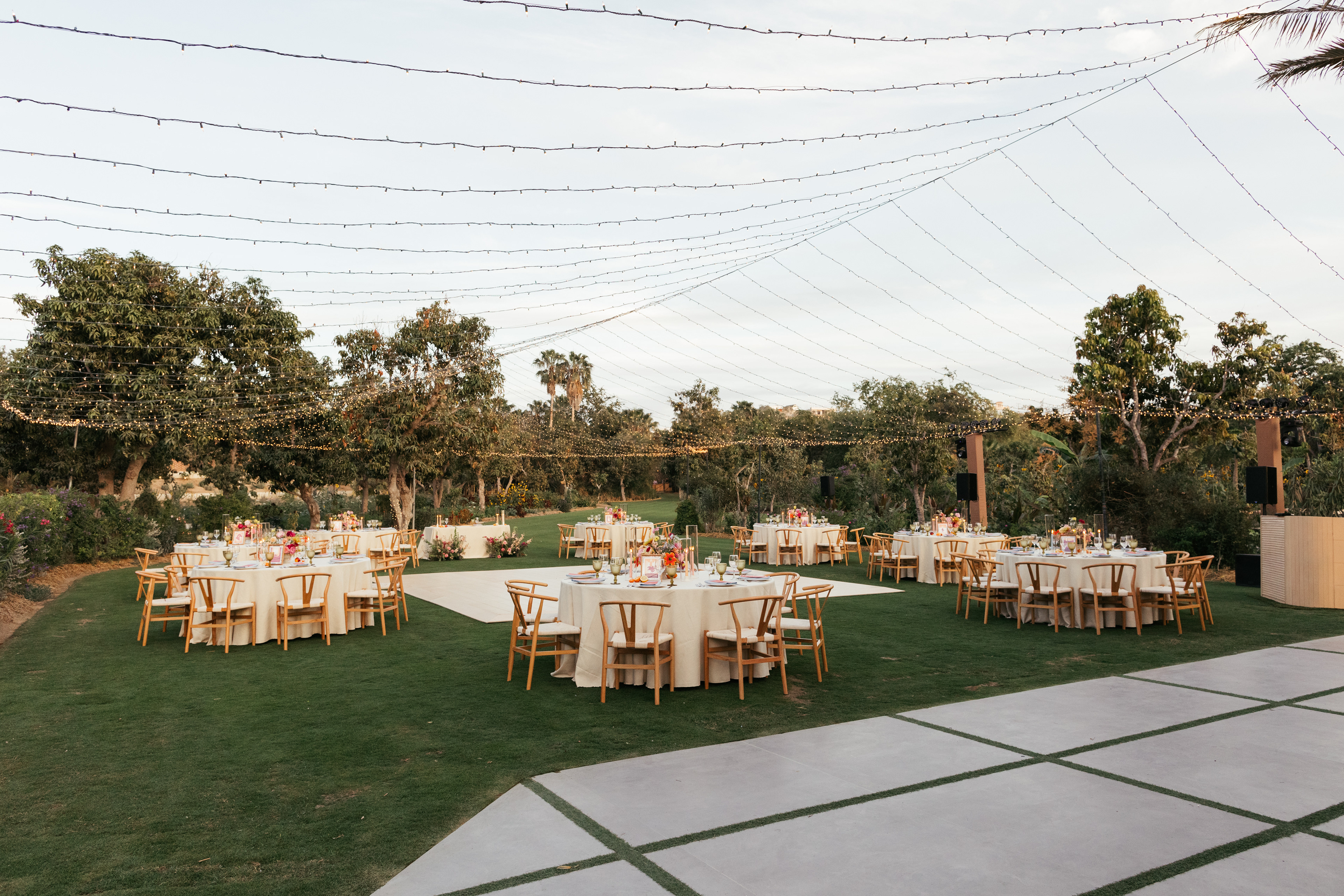
Capture the event's essence: A charming organic farm in Cabo with a warm, relaxed, playful aesthetic.
Make travel & logistics easy: Guests needed a clear, engaging way to visualize the locations and flow of different events.
Create a personal touch: Infuse elements of our story into the design in a way that felt sophisticated, not overwhelming.
Process & Tools
I illustrated elements in Procreate, compiled layouts in Photoshop, and worked with carefully selected vendors to bring the final prints to life. Given the tactile nature of print, material selection was key—for most materials, I chose 100# felt weave cover stock to add a subtle texture that felt premium yet inviting.
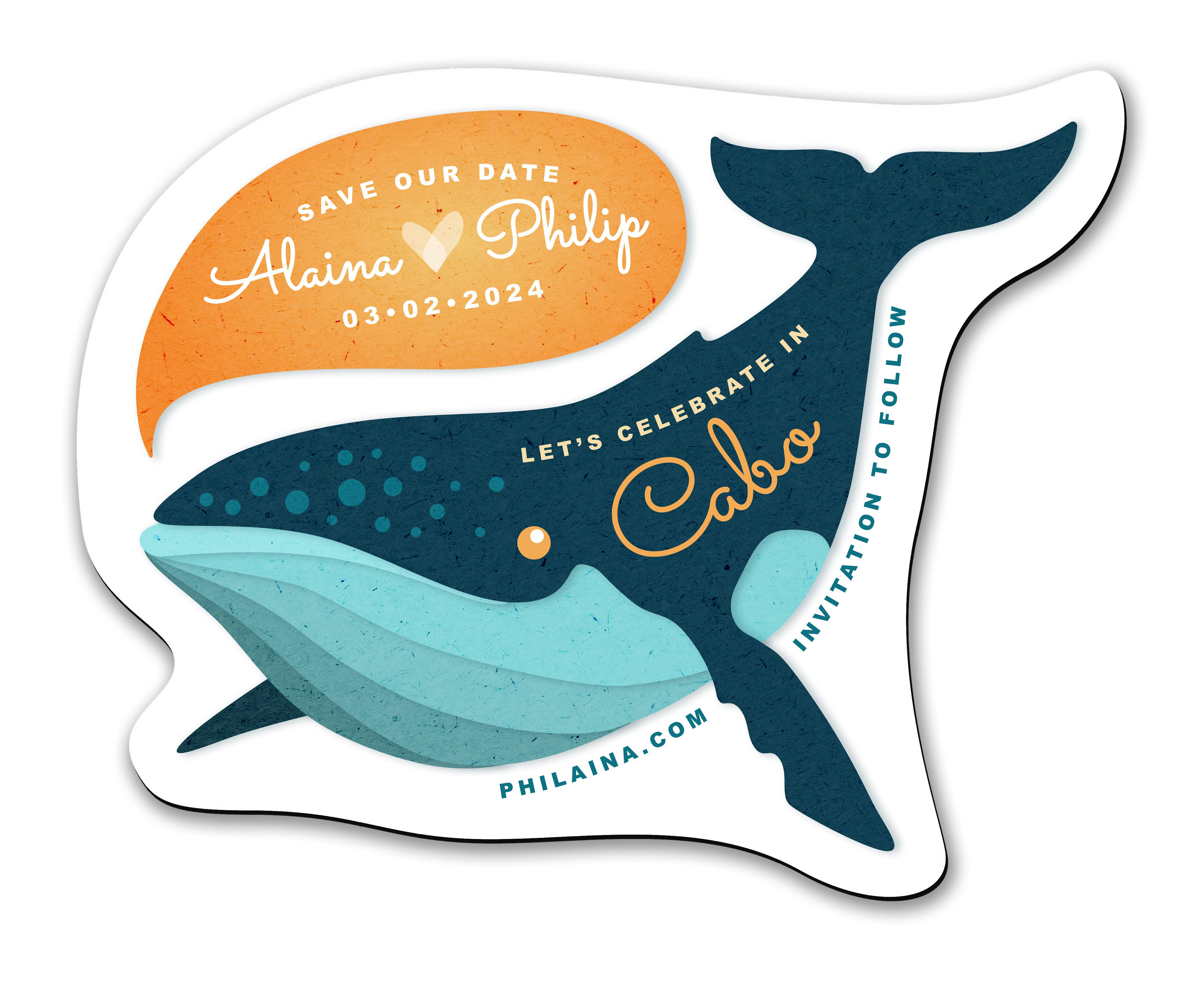
Save the Dates: Themed Die-Cut magnets
Inspired by whale season in Cabo, I illustrated a playful humpback whale, knowing that one of our events would be a sunset sail to see them. We chose magnets for their functionality and longevity—unlike traditional paper Save the Dates, they’re often displayed on fridges as a daily reminder and can even serve as a keepsake long after the wedding. Many of our friends and family still have them up, which makes it even more special!
To bring it to life, I illustrated the whale in Adobe Illustrator, then added a paper texture in Photoshop before sending it to print.
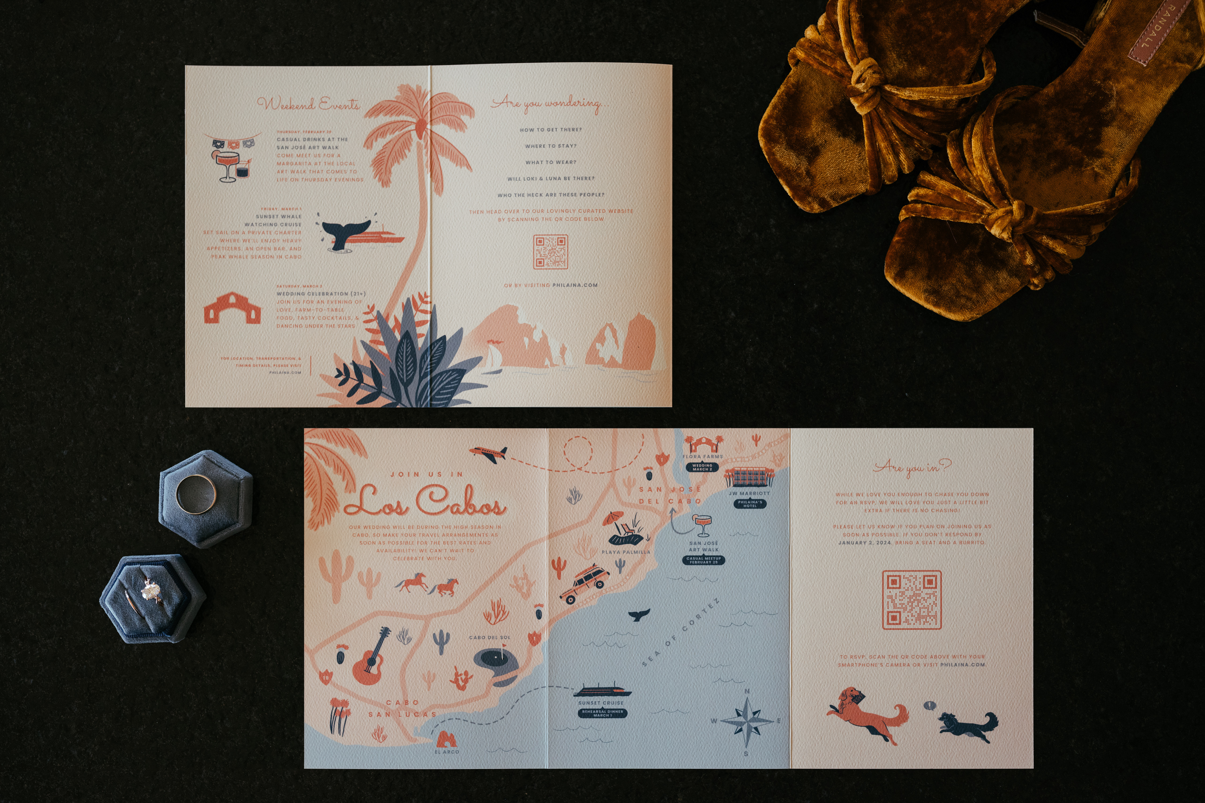
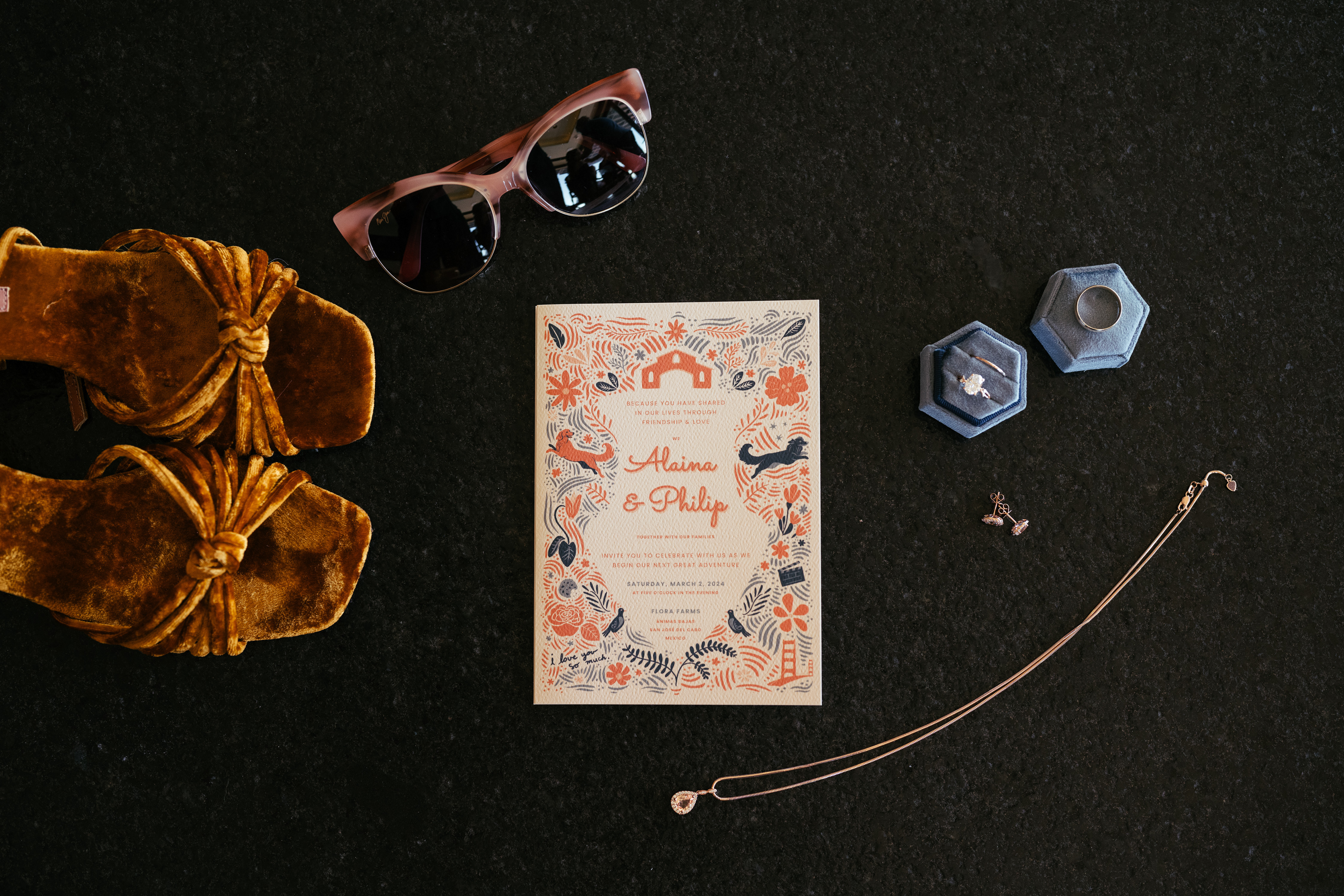
Invitations: The Illustrated Z-Fold
Our invitations were designed to be both deeply personal and very functional. The cover featured a collection of meaningful Easter eggs—small illustrations that reflect our relationship and shared experiences.
On the back spread, I created a hand-illustrated map to clarify event locations and help guests distinguish between San José del Cabo and Cabo San Lucas. Since travel logistics were key, we wanted our wedding website to be the primary source of truth, ensuring guests always had the most up-to-date details. To reinforce this, we included both QR codes and a URL on nearly every panel, making it easy for guests to access the latest information as the event approached.
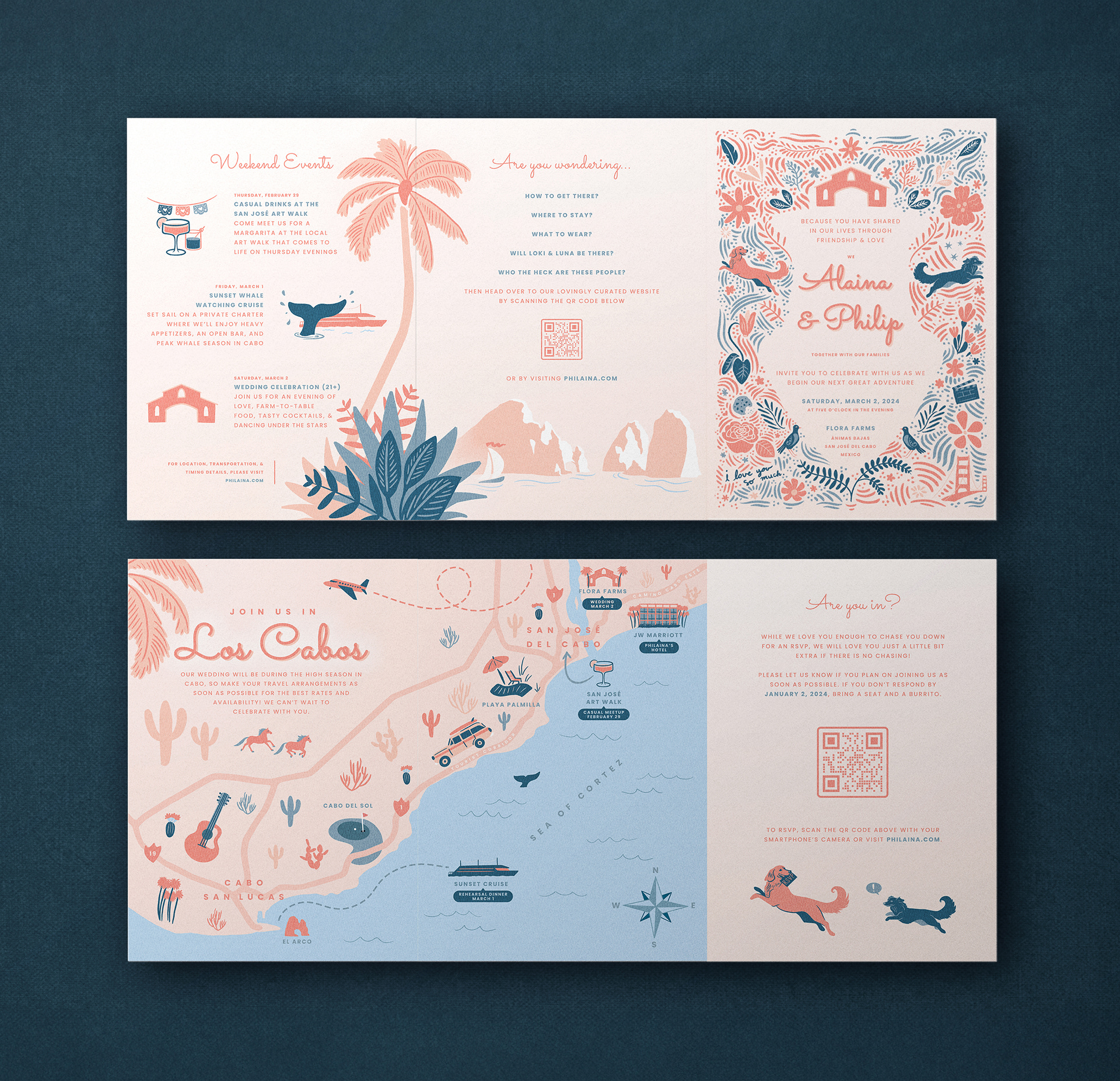
Mockup of Z-fold printed on 100# felt weave cover stock
5x7 folded, 15x7 unfolded
5x7 folded, 15x7 unfolded


Since chasing down RSVPs is such a common experience, I decided to illustrate it using our pups, Luna and Loki.
Menus: A Celebration of Place & Sustainability
Our menus were designed to be both functional and meaningful, doubling as place cards that welcomed guests to their seats. One side featured the illustrated barn from our invitations, reinforcing the visual identity of our venue, while the other displayed the carefully curated family-style menu awaiting them. To further embrace the magic of Mexico, I hand-illustrated small embellishments inspired by traditional motifs, adding a touch of personality and craftsmanship to the design.

Mockup of our menus/placecards, printed on 4x9" 100# felt weave cover stock
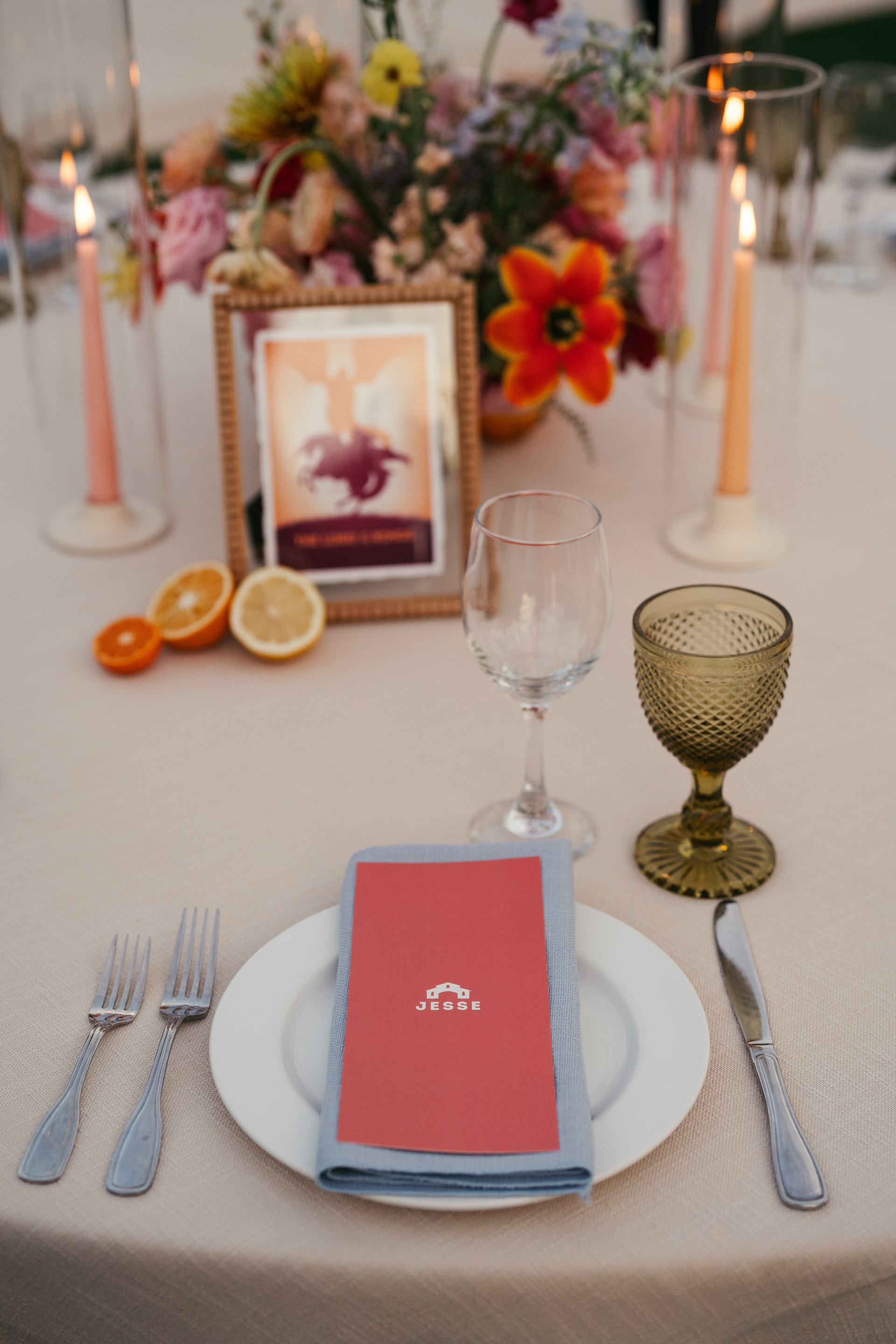


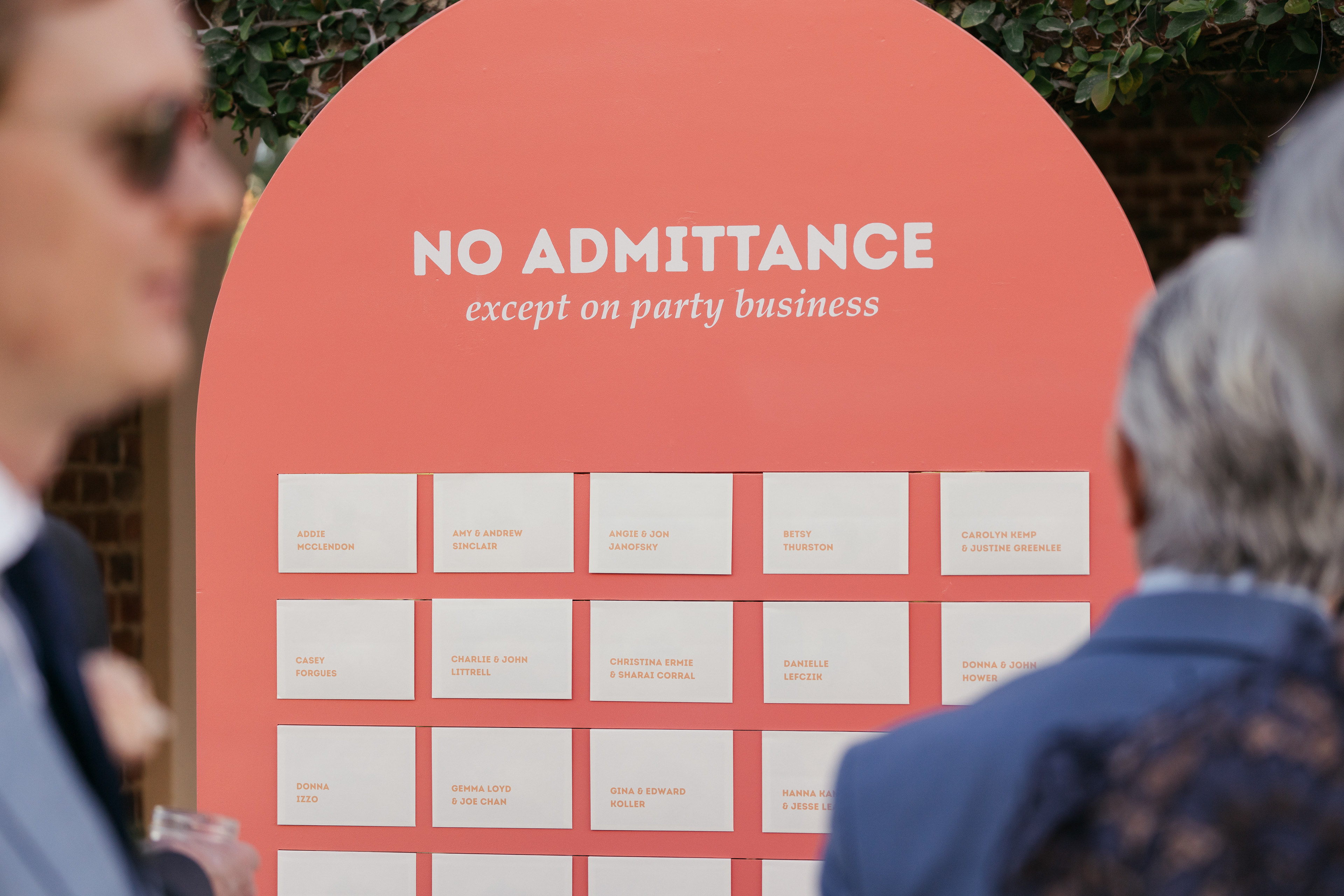
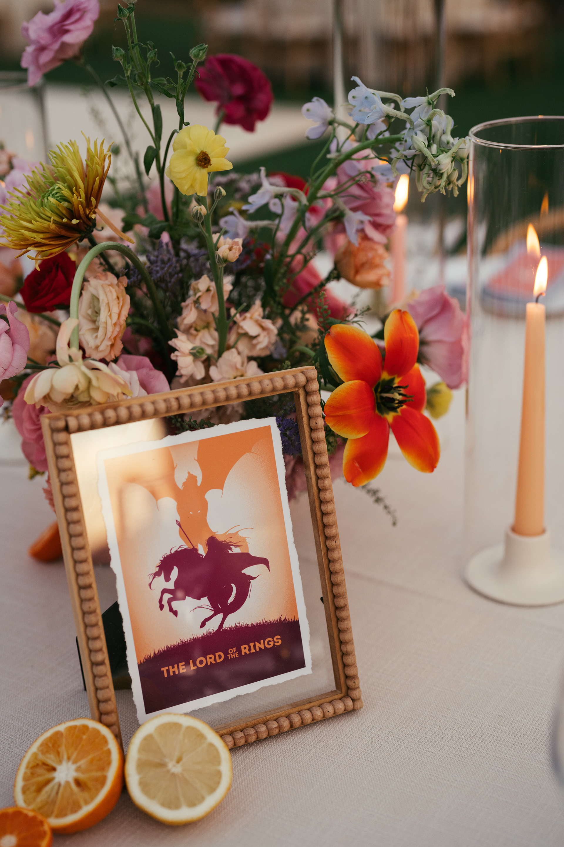
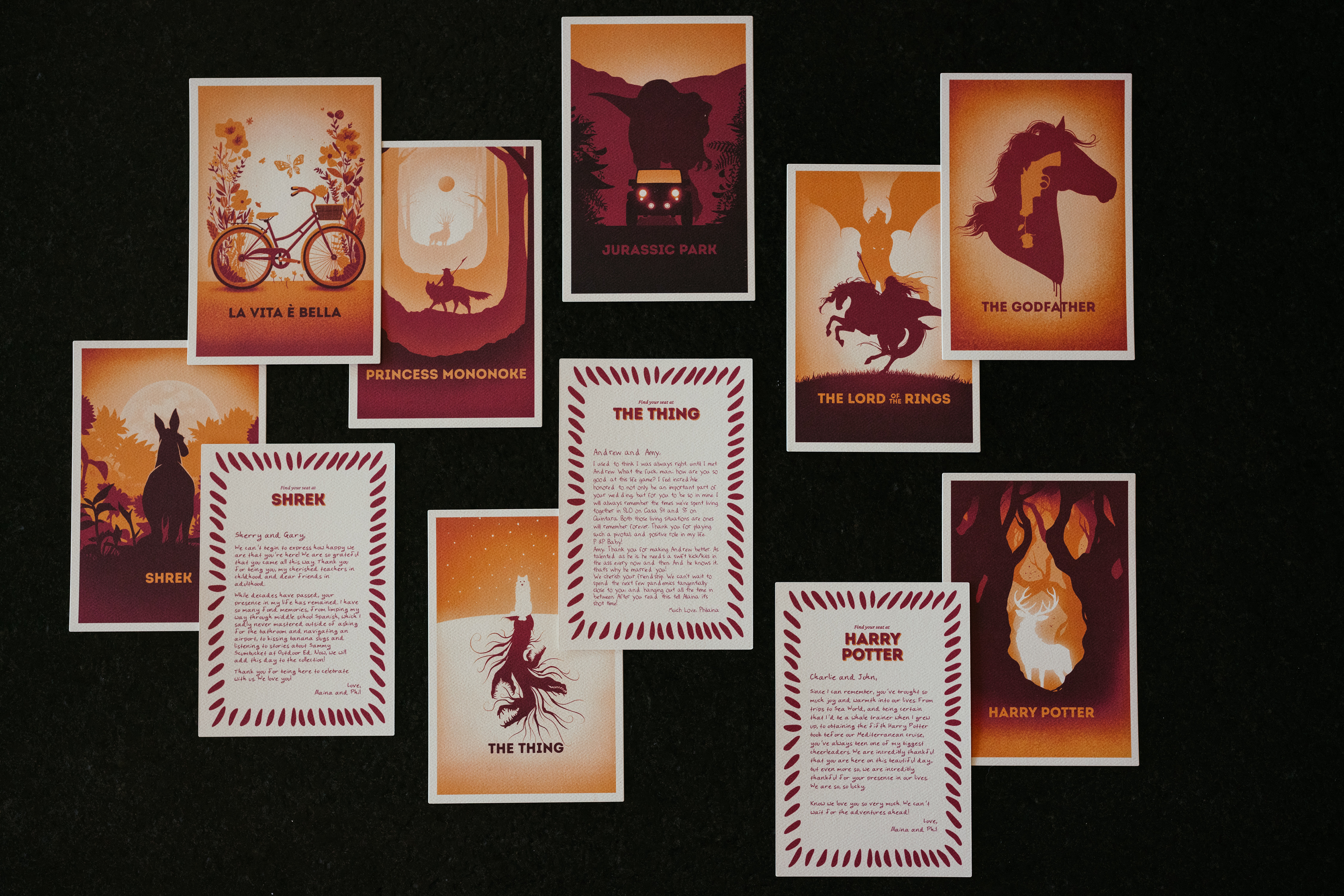
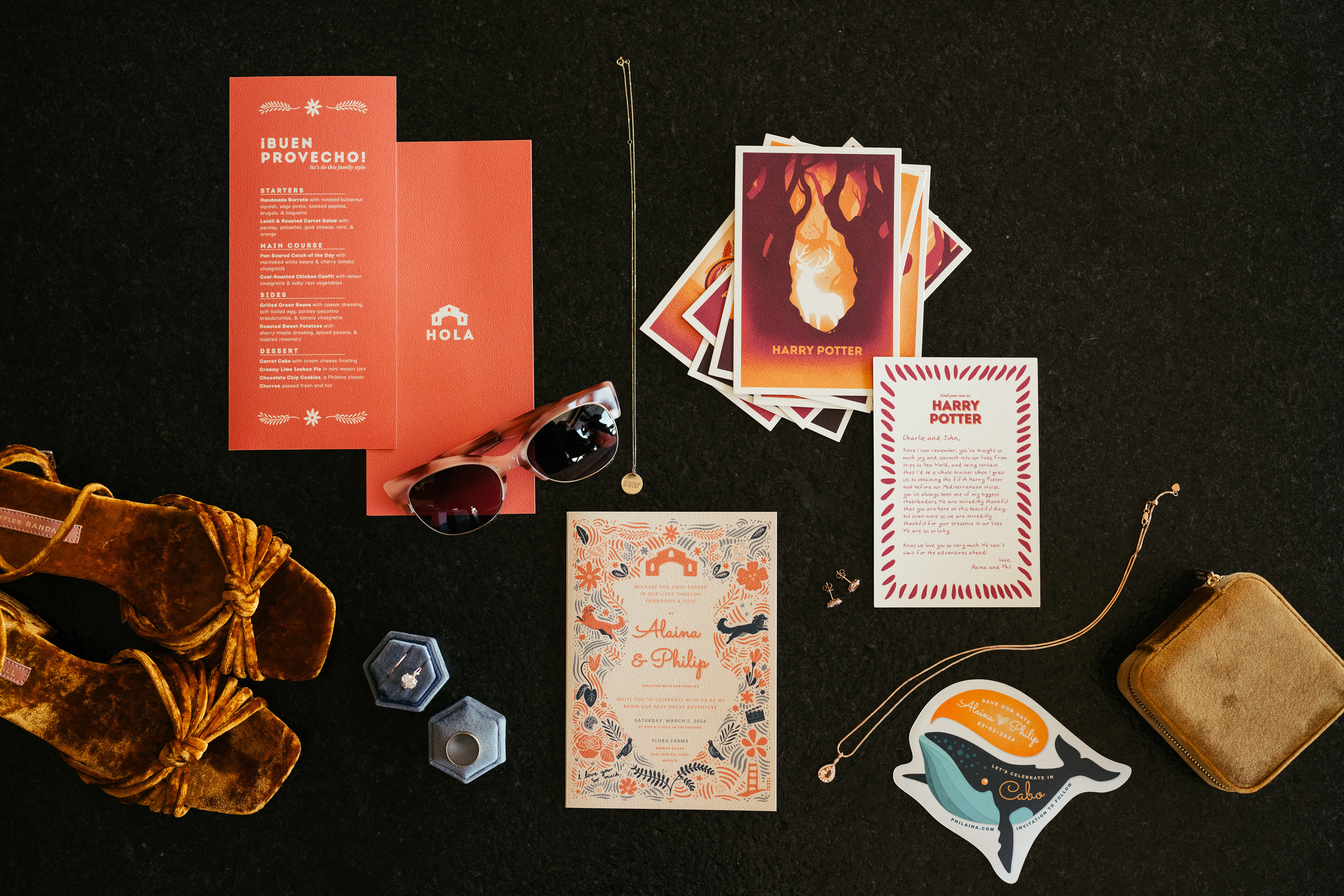
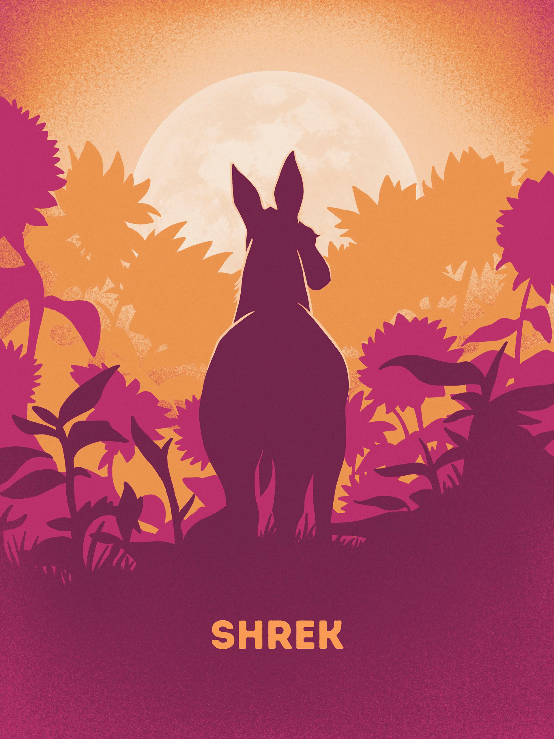
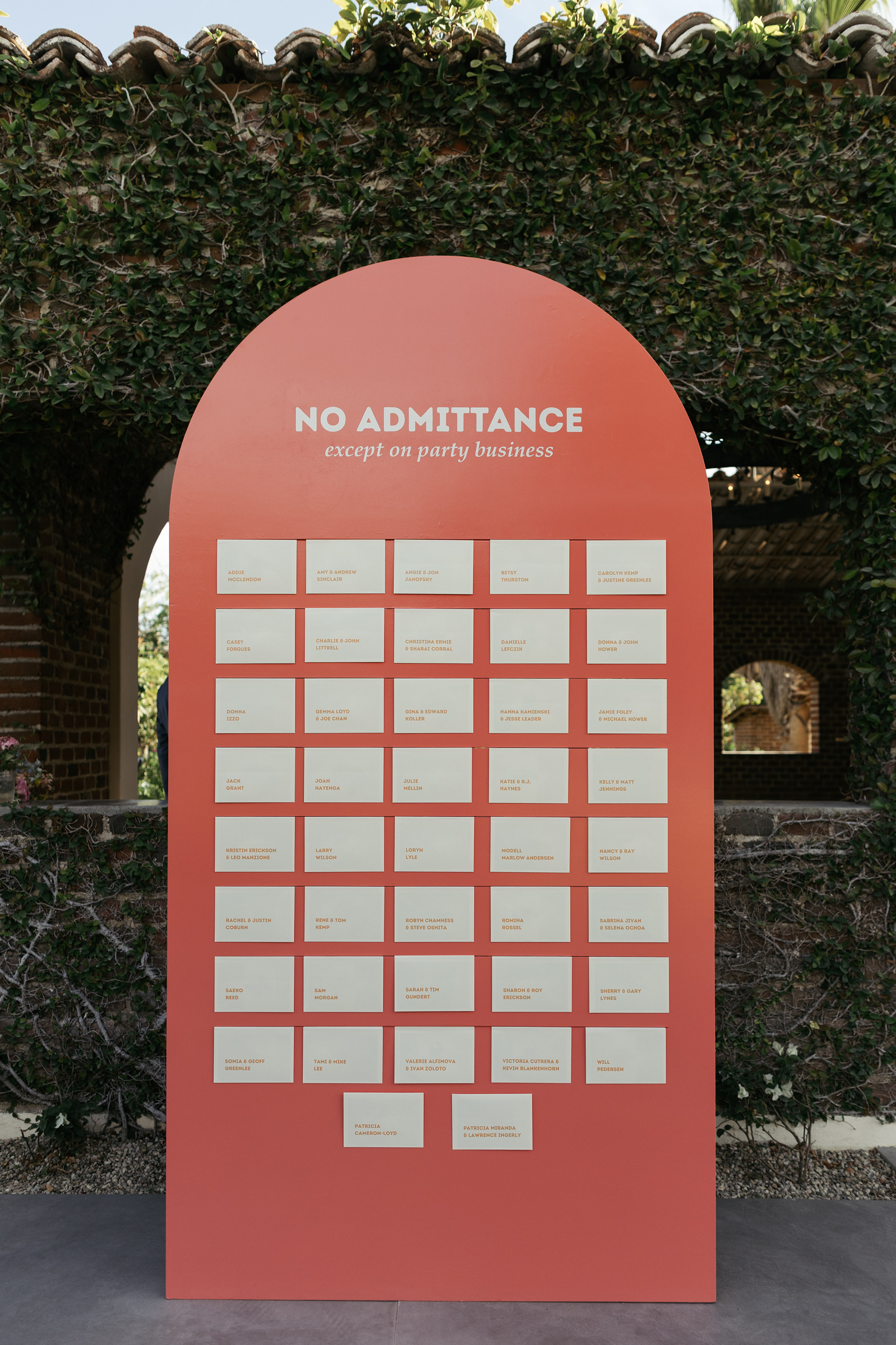
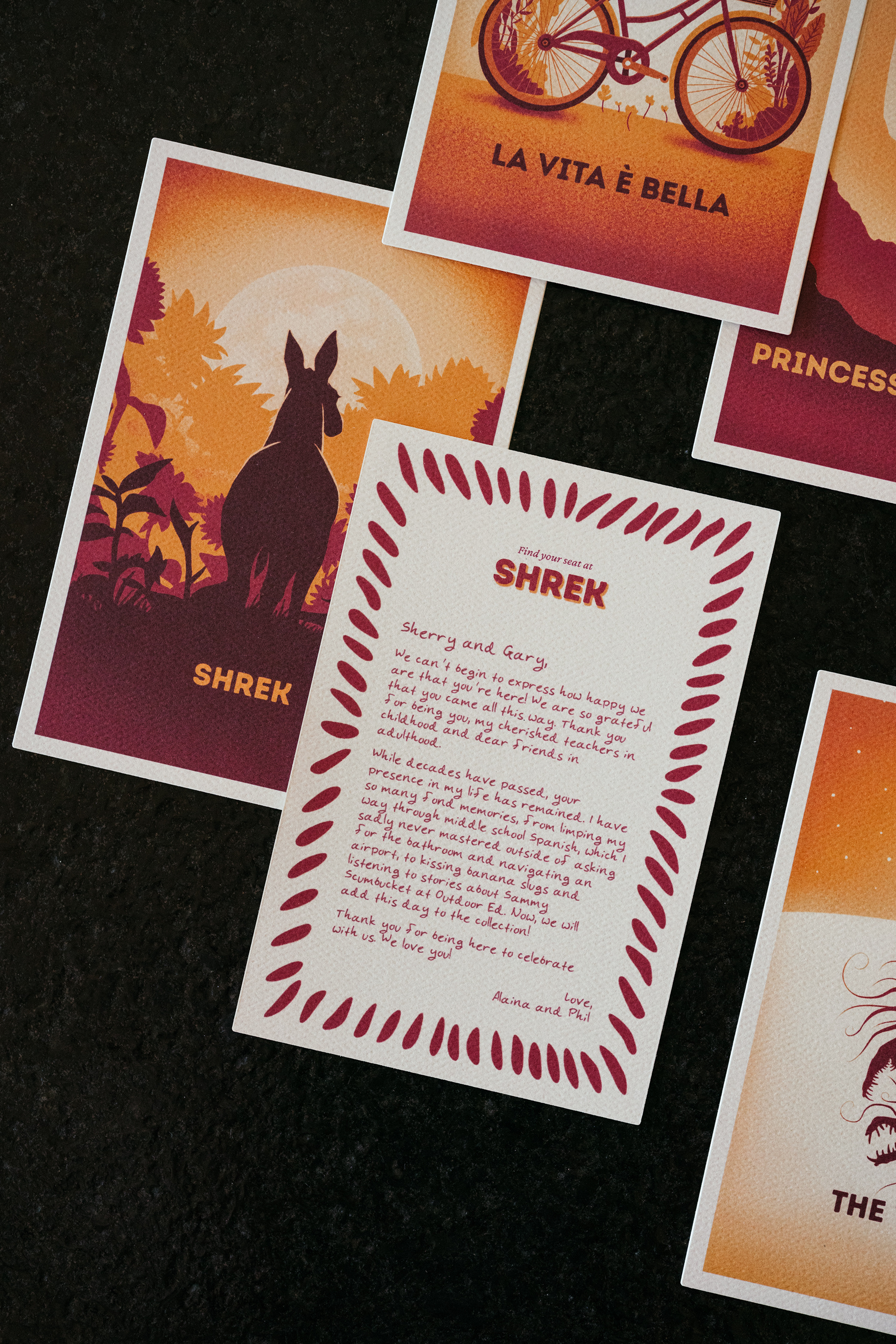
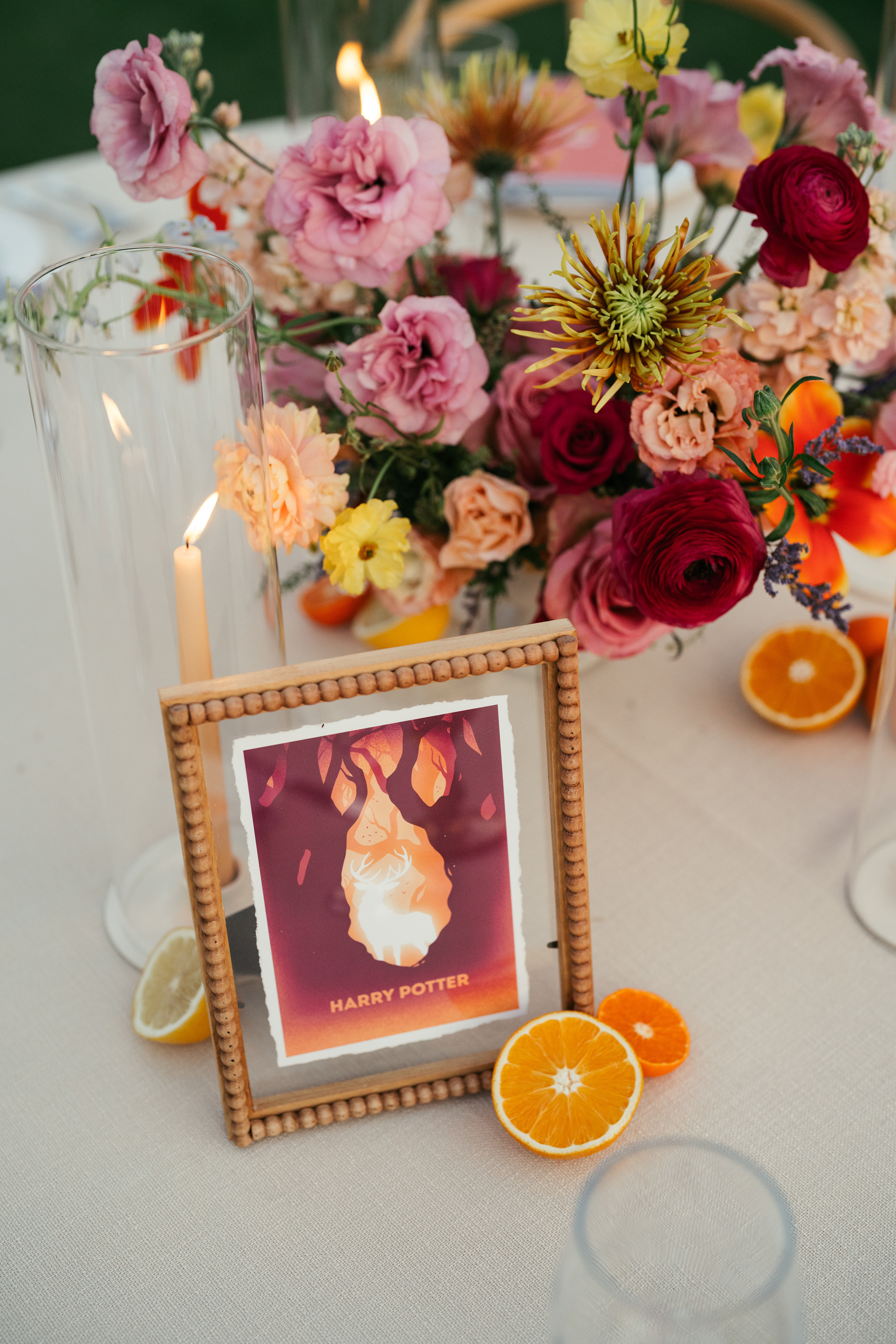
Table “Numbers” & Escort Cards: A Cinematic Tribute
Movies have always been a special part of our relationship, from the films that made us laugh to the ones that sparked deep conversations. Instead of traditional table numbers, we assigned each table a film that held personal meaning to us—ranging from the silly to the sentimental.
To ensure a cohesive aesthetic and personalized touch, I hand-illustrated each movie poster in a consistent style and color palette, tying the visual identity of our wedding together while allowing each table to feel unique.
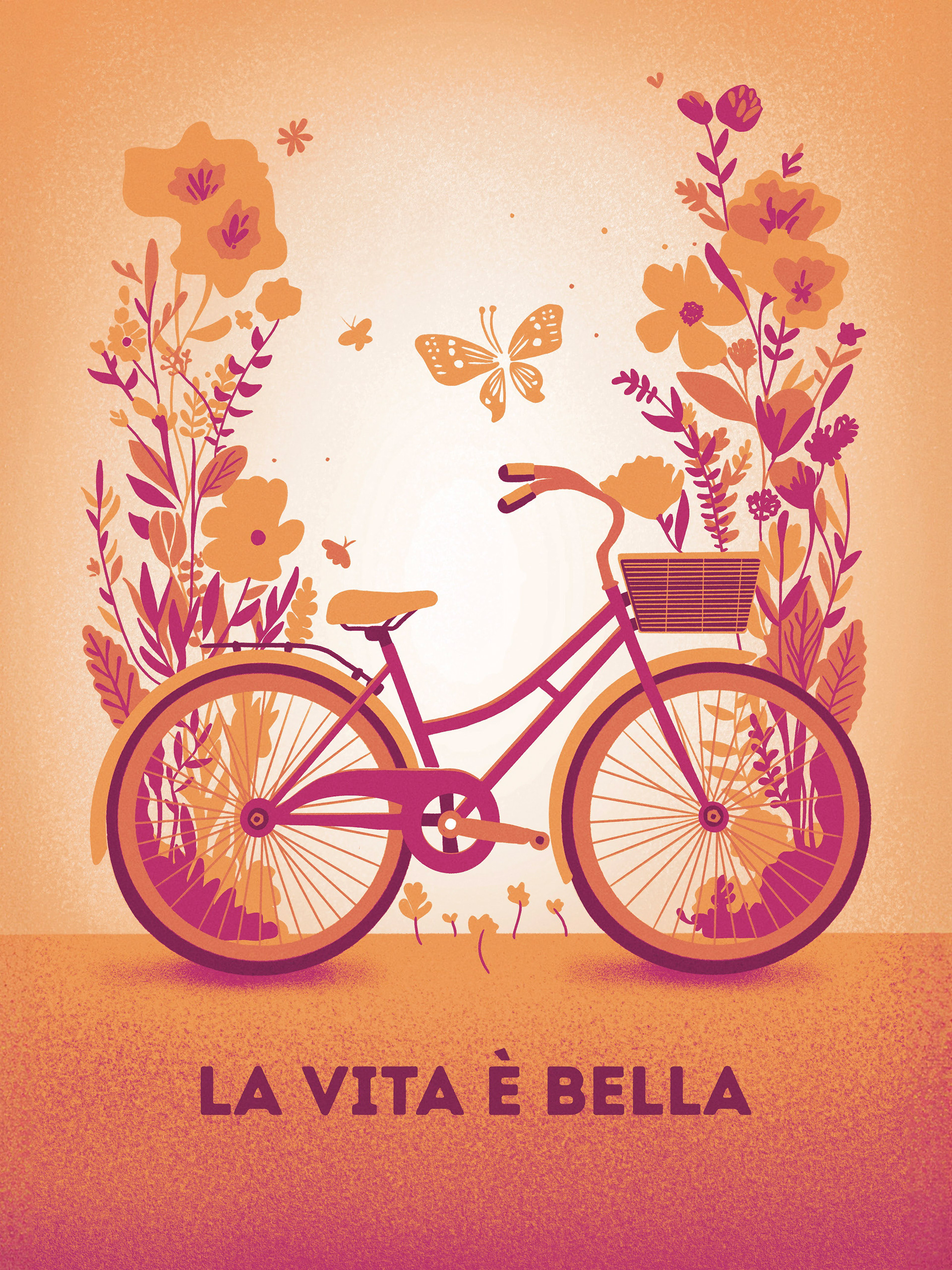
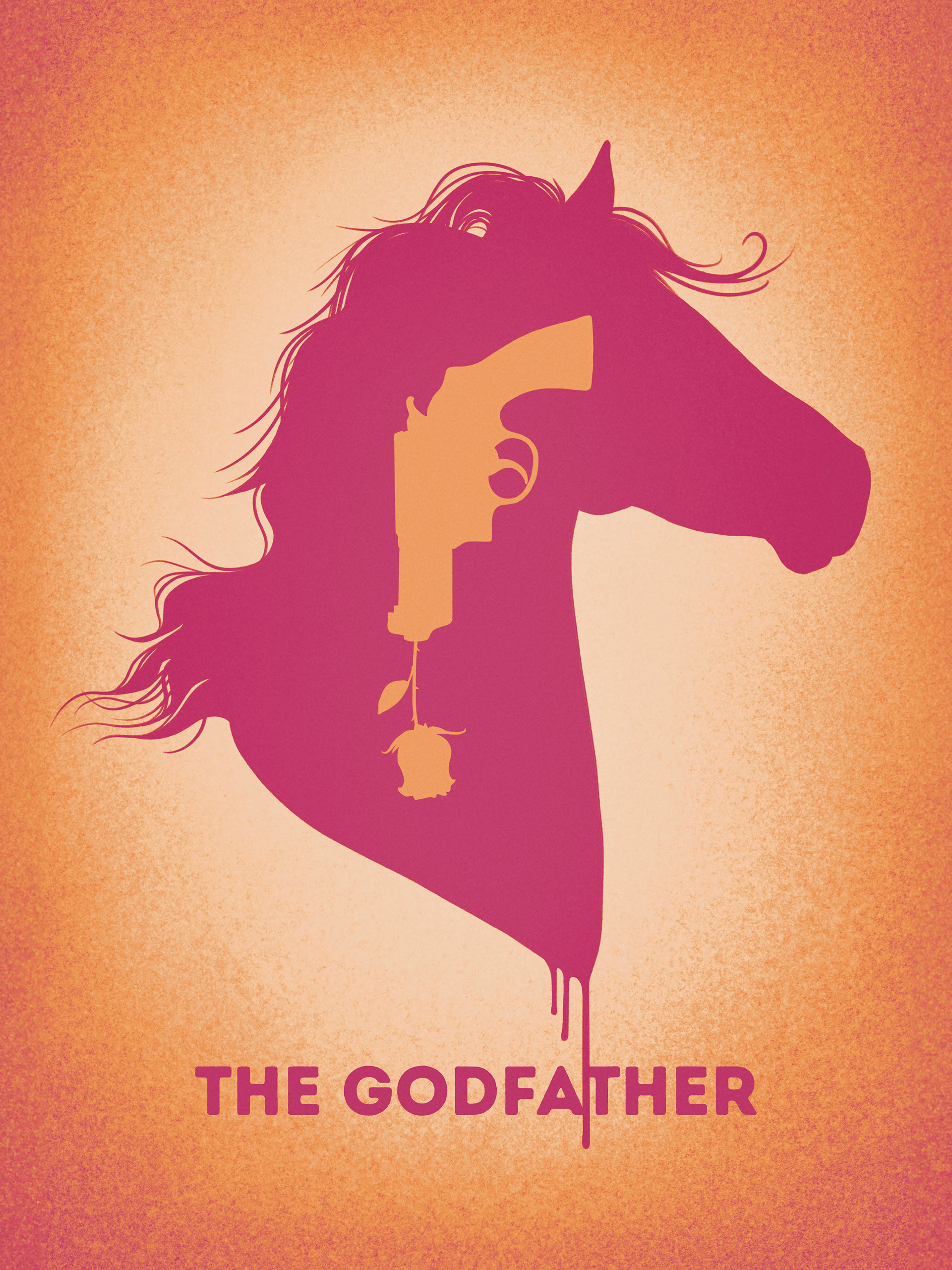


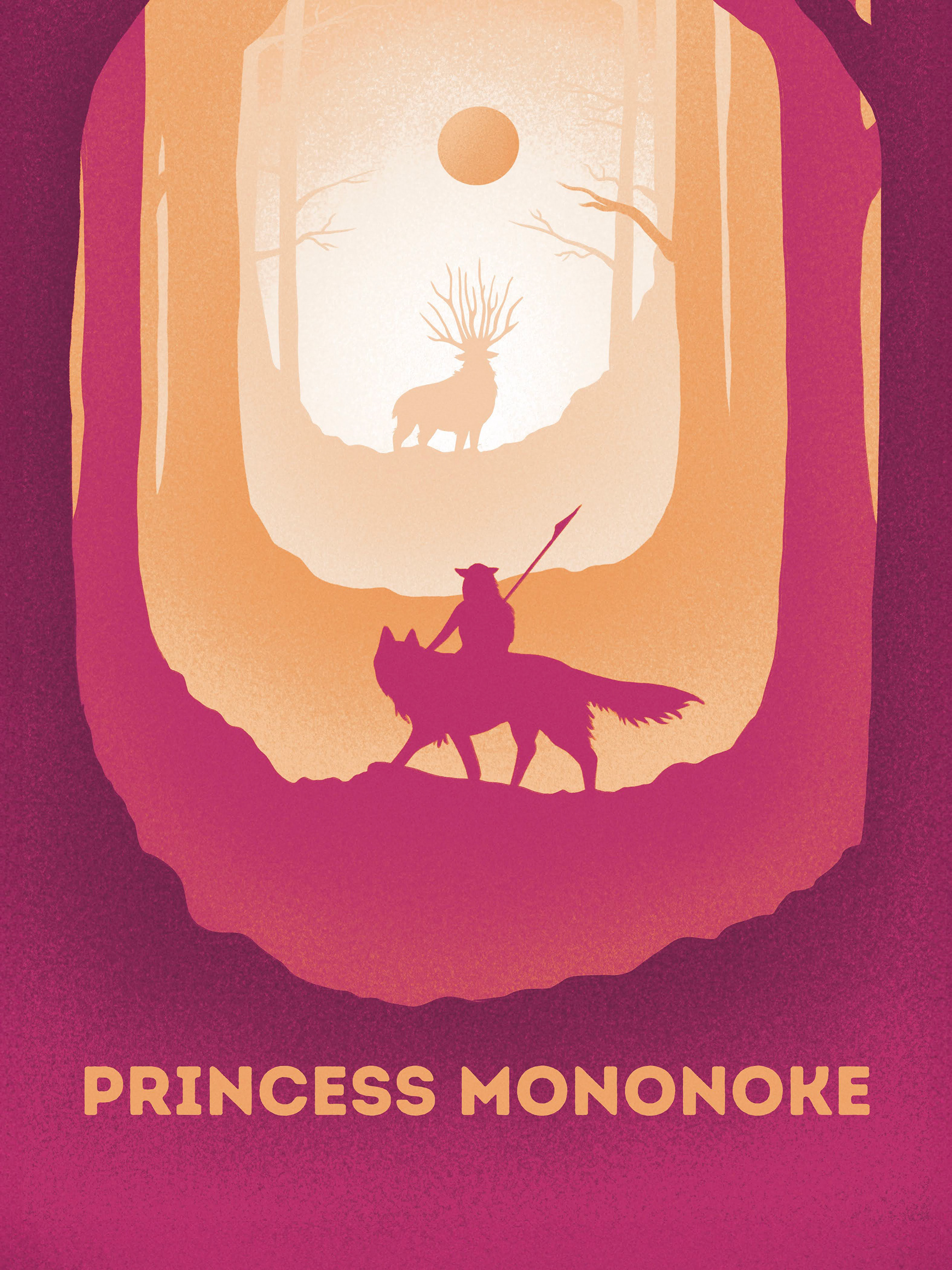

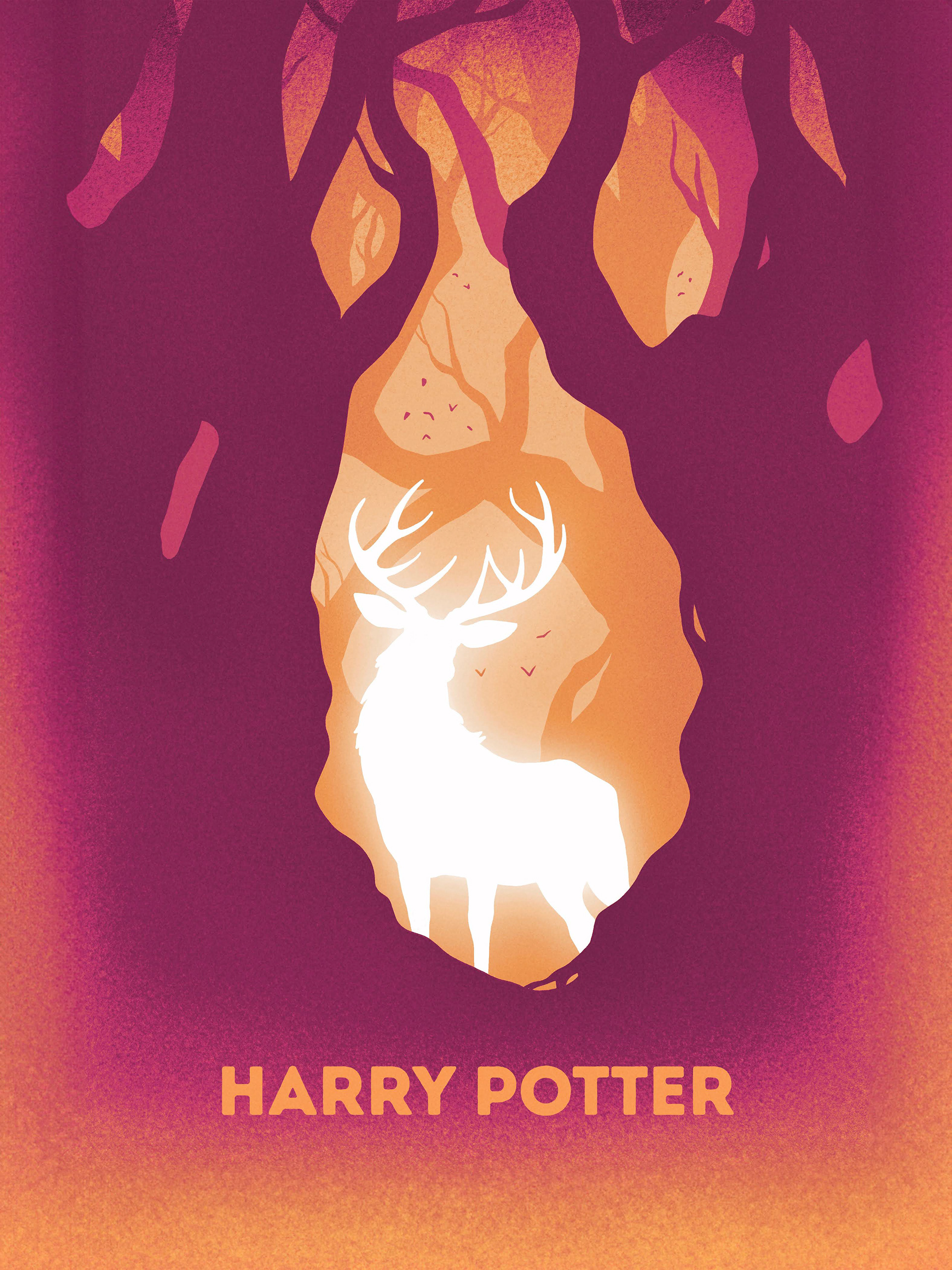
We knew that our guests were traveling from all over the world to celebrate with us, and we wanted each person to feel uniquely seen and appreciated. Each guest received a sealed envelope containing a 4x6 card with their table’s movie poster printed on one side and a heartfelt note* on the other, personalized to them
* I made both my husband's and my own handwriting into fonts and printed these since hand-writing 70+ notes without screwing up was a tall order! We had a limited number of these cards, so this method ensured it was going to be enough.
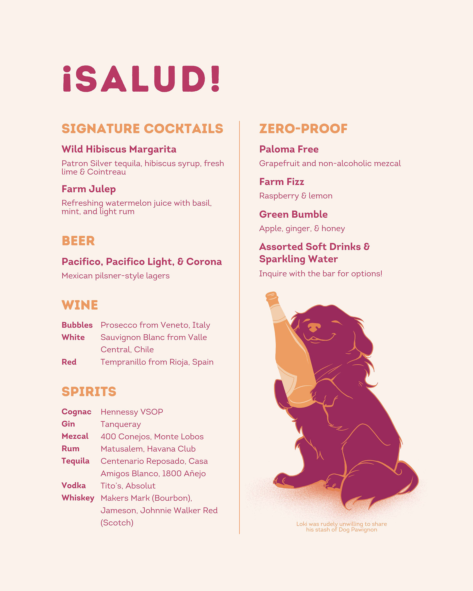
Signage: Purposeful & Personal
We wanted our wedding signage to be both functional and meaningful, avoiding excess while ensuring every piece served a clear purpose. Each sign was designed to blend playfulness, personal storytelling, and practicality while complementing the overall aesthetic.

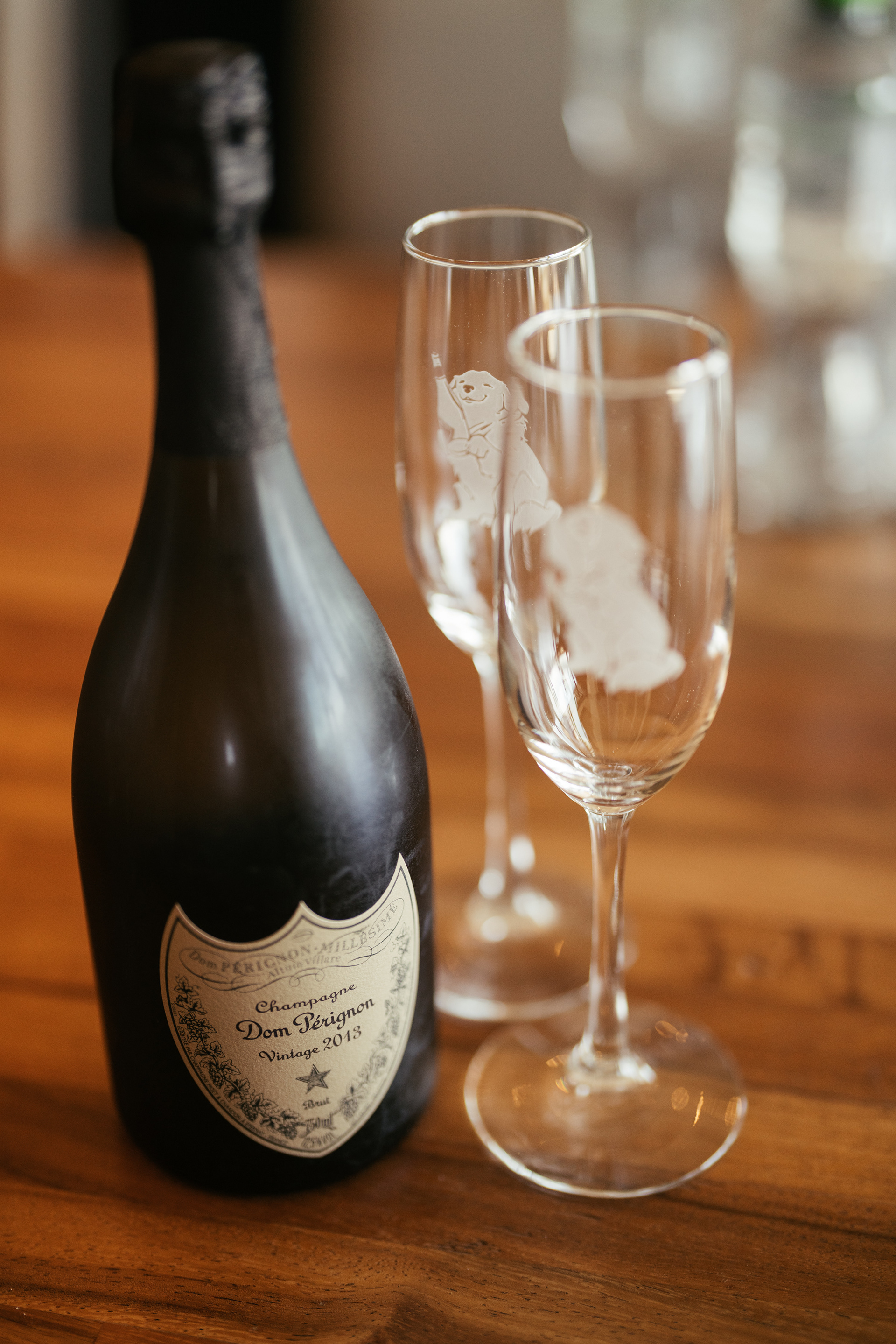
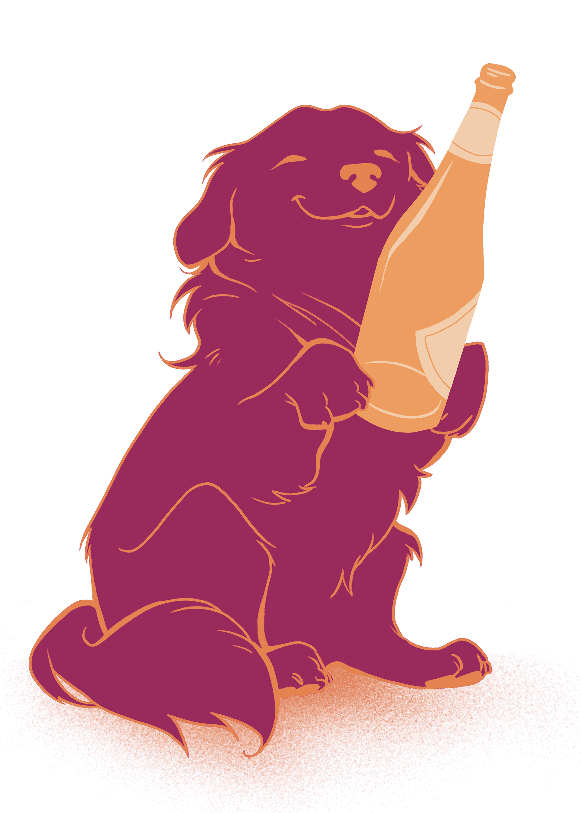
Our bar menu, including an illustration of our dog holding a bottle of champagne
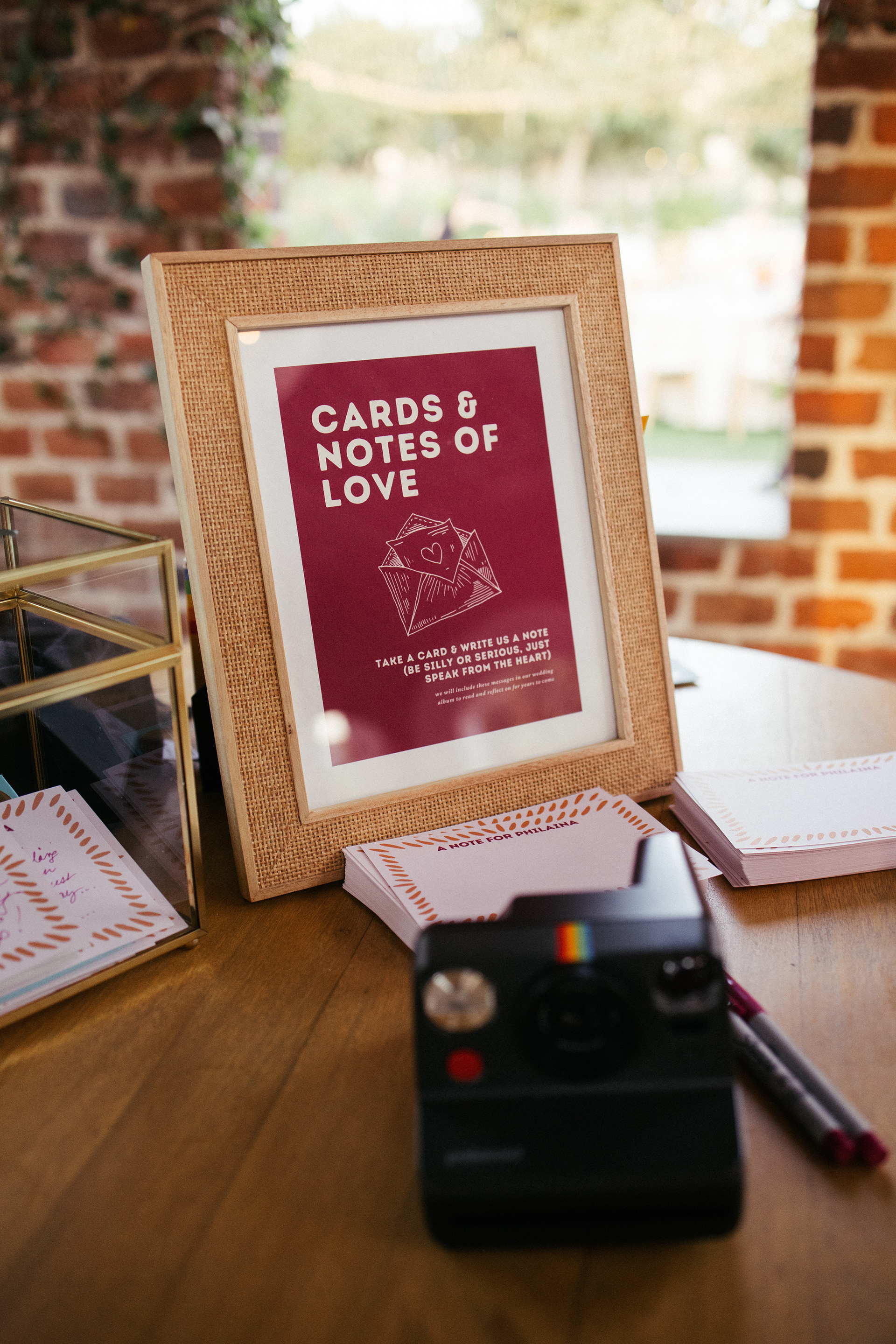
Signage for our card table

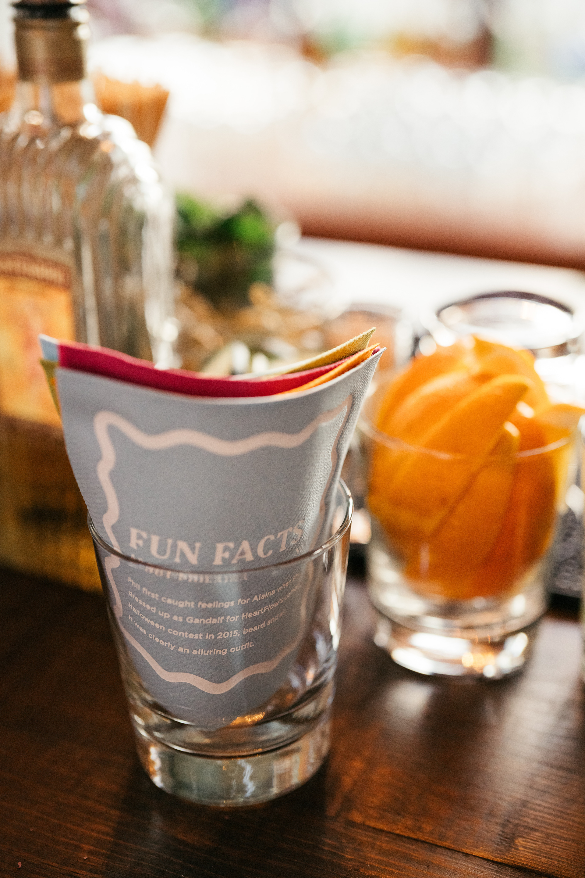
Custom made and printed cocktail napkins to add a fun flare to the bar
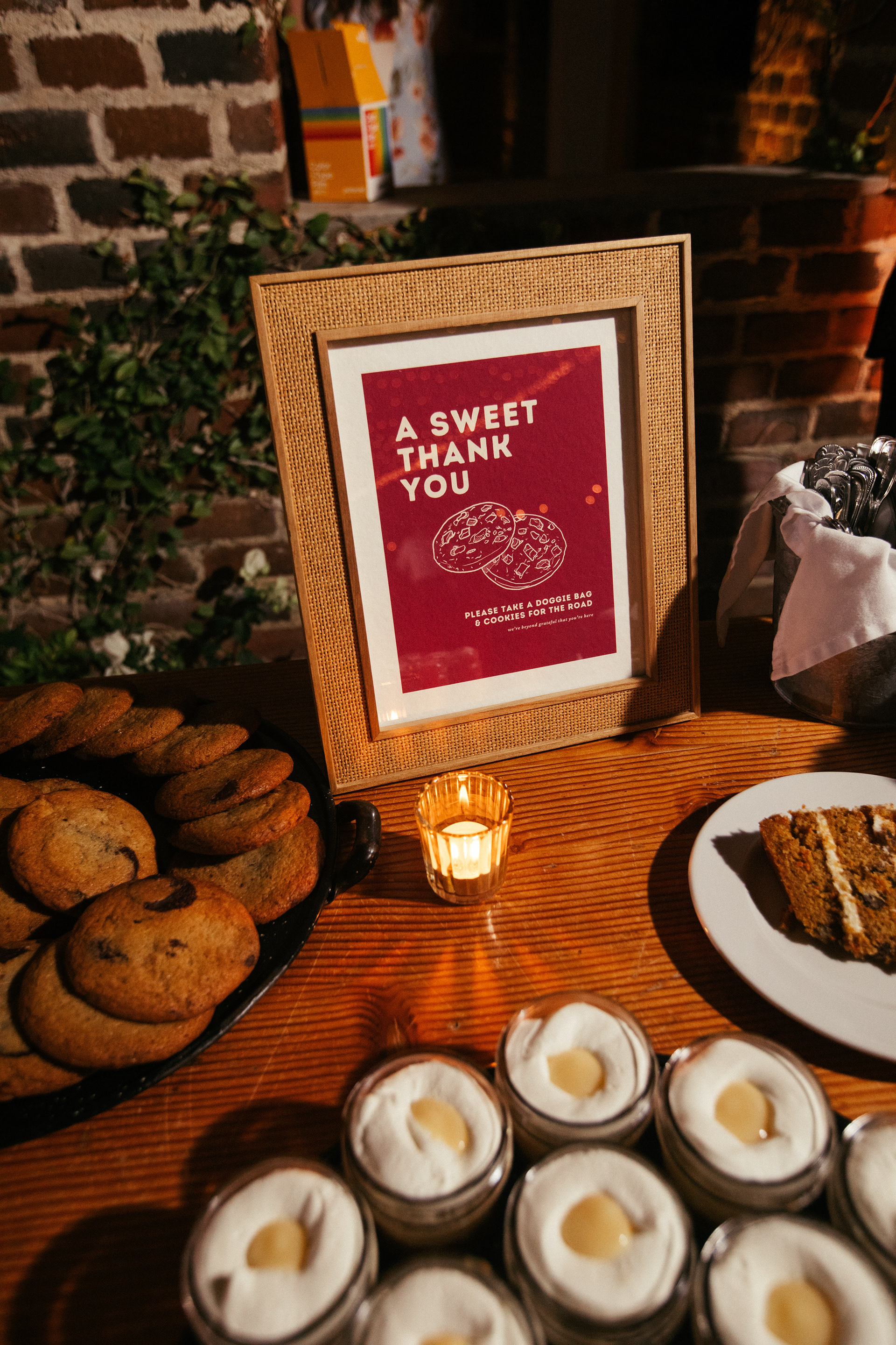
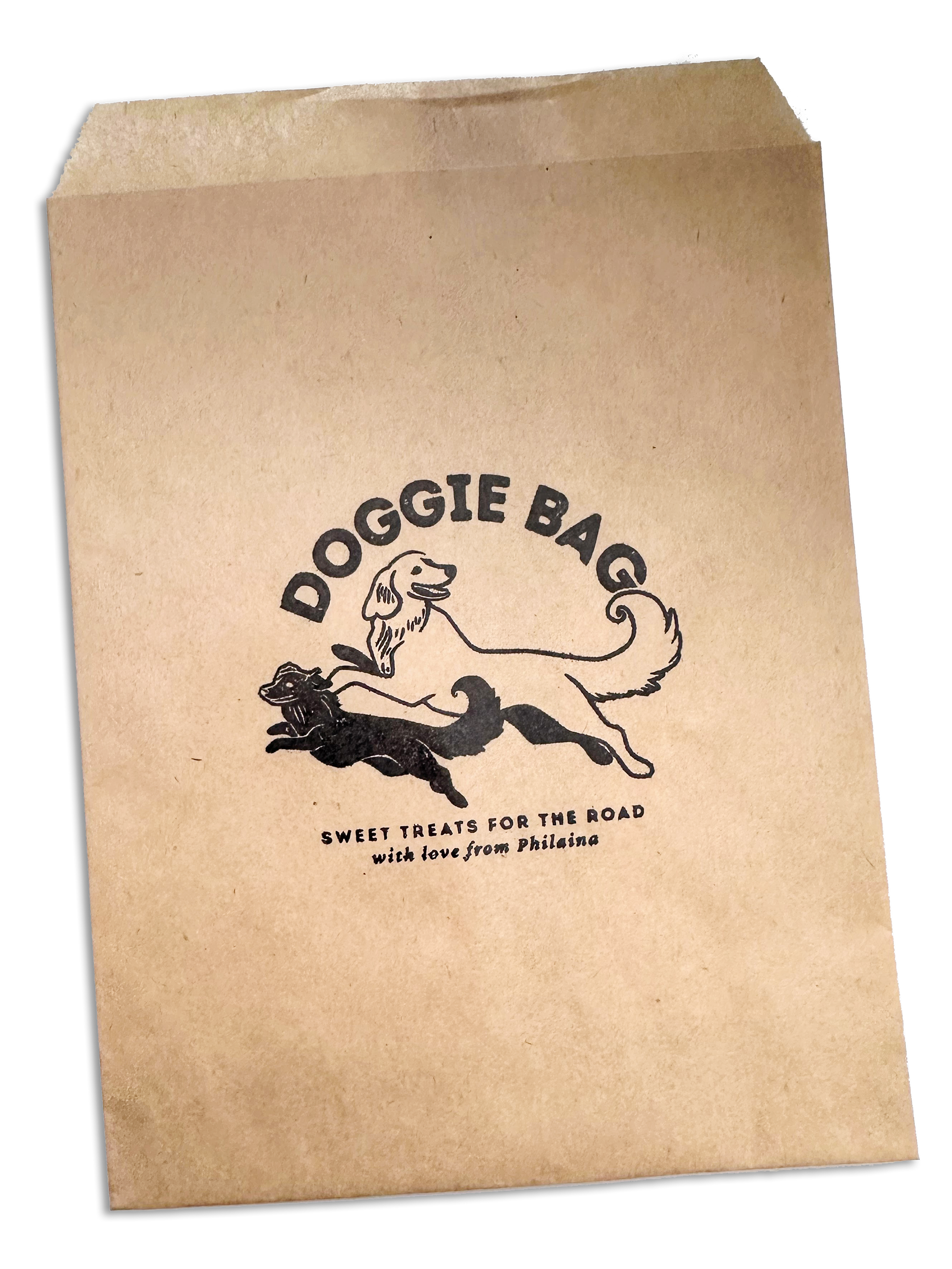
Signage for our dessert table, including a CTA to take home some cookies!
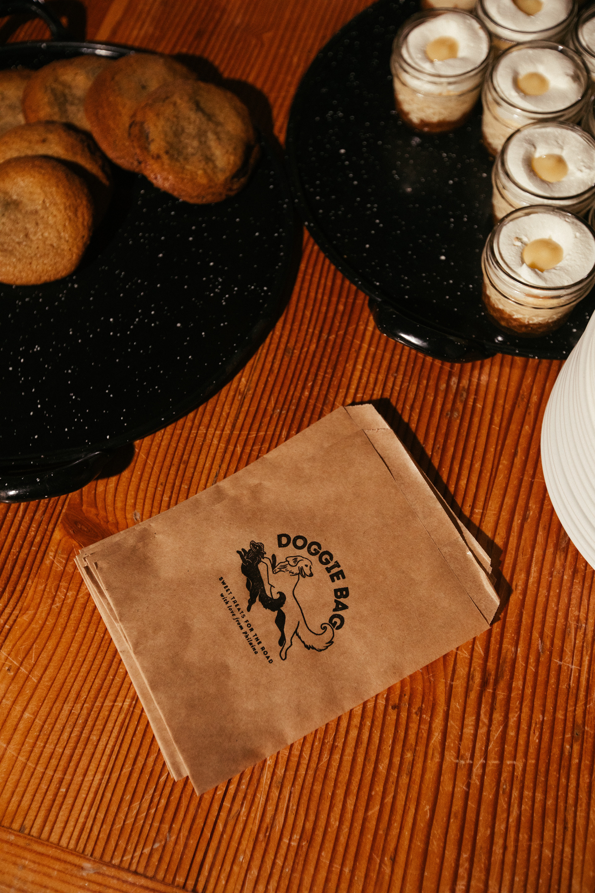
I hand-stamped these takeaway bags for a personalized touch

Bringing It All Together: Storytelling Through Design
From the very first Save the Date to the final escort cards, every piece of our wedding stationery was thoughtfully designed to create a seamless, deeply personal, and immersive experience for our guests. We wanted the event to feel like an extension of who we are as a couple—filled with warmth, storytelling, and intentional details that reflected our personalities, passions, and gratitude for those who traveled to celebrate with us.