While detailed illustration, design, and workflows are my bread and butter, there's something I love deeply about the instant gratification of photography. When I started taking photos in 2011, I mostly captured my travels and sought quiet, clear nights to shoot the stars (Canon even reposted one of my astro shots). When the pandemic hit in 2020, I felt compelled to use this skill to further connection in my life; it was a lonely, isolating time.
When I set out to design a logo for my photography, which eventually became an overarching personal brand, I wanted something that reflected not just my love for compelling visuals but also the grace, movement, and expressiveness of the subjects I love most. Horses have always been one of my favorite creatures (yes, I am Tina Belcher at heart), and I wanted to capture their elegance, power, and spirit in a timeless yet personal way.
Inspiration
While I’ve spent my career refining detailed illustration, workflows, and visual systems, I’ve always been drawn to the simplicity and impact of minimalism. I took inspiration from Picasso’s single-line drawings, which convey so much character with so little.
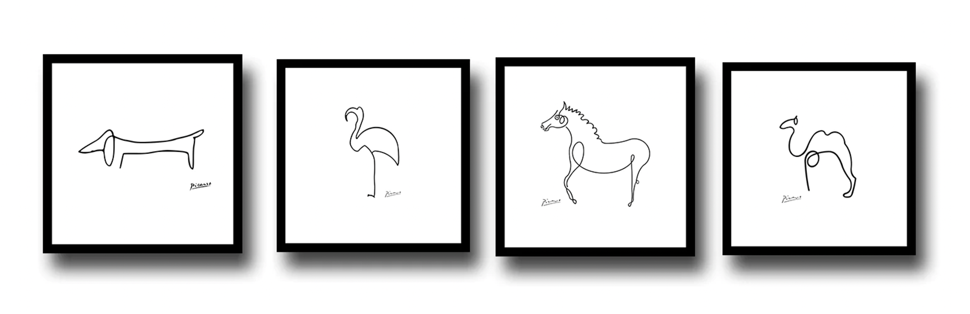
I wanted to embrace that philosophy—elegant and full of life—while incorporating something uniquely mine.
Design Process
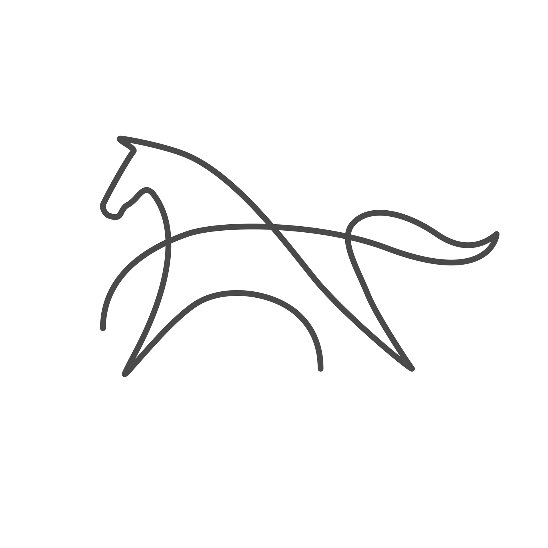
The goal was to create a single, fluid line that naturally forms both a galloping horse and the initials “A” and “H”. The challenge was finding a balance between abstraction and legibility—where the horse remains recognizable, dynamic, and evocative, but the design stays sleek and minimal.

"A" is loosely implied in the highlighted area
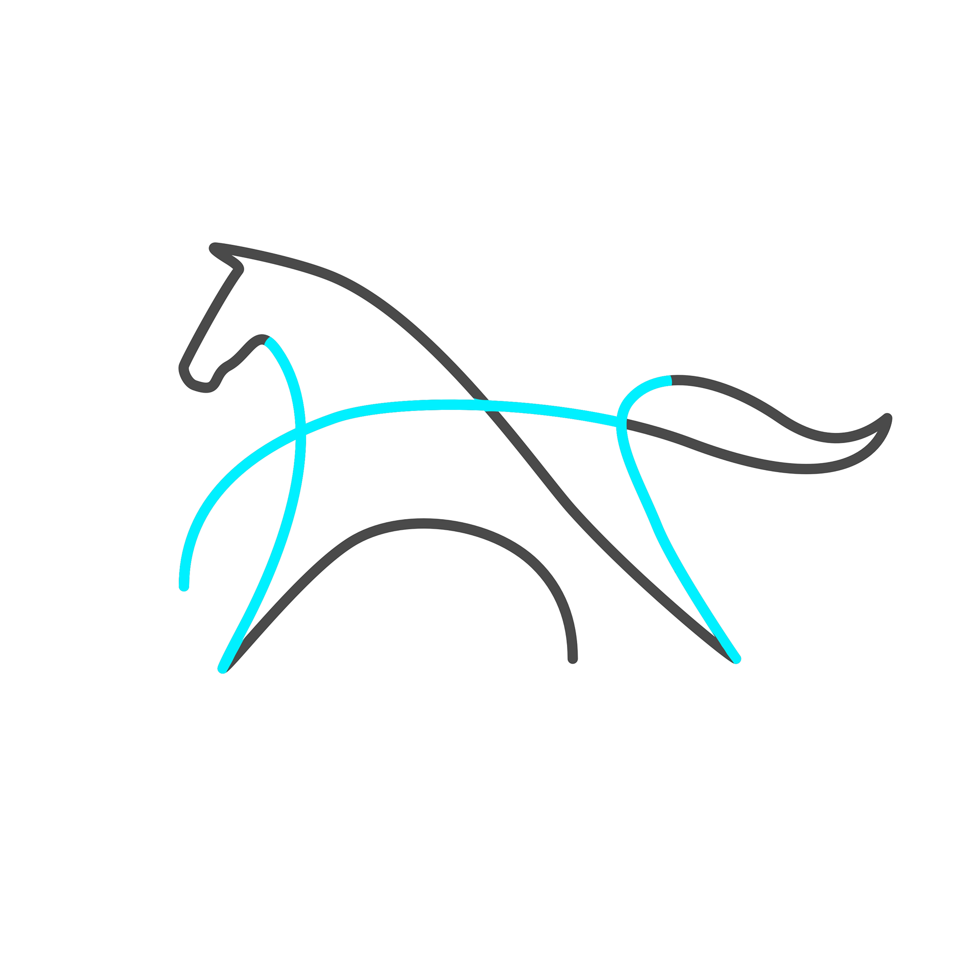
"H" is loosely implied in the highlighted area
Final Logo for Alaina Hower Photography
After multiple iterations refining the curves and intersections, I landed on a design that embodies movement and fluidity while keeping a sense of structure.
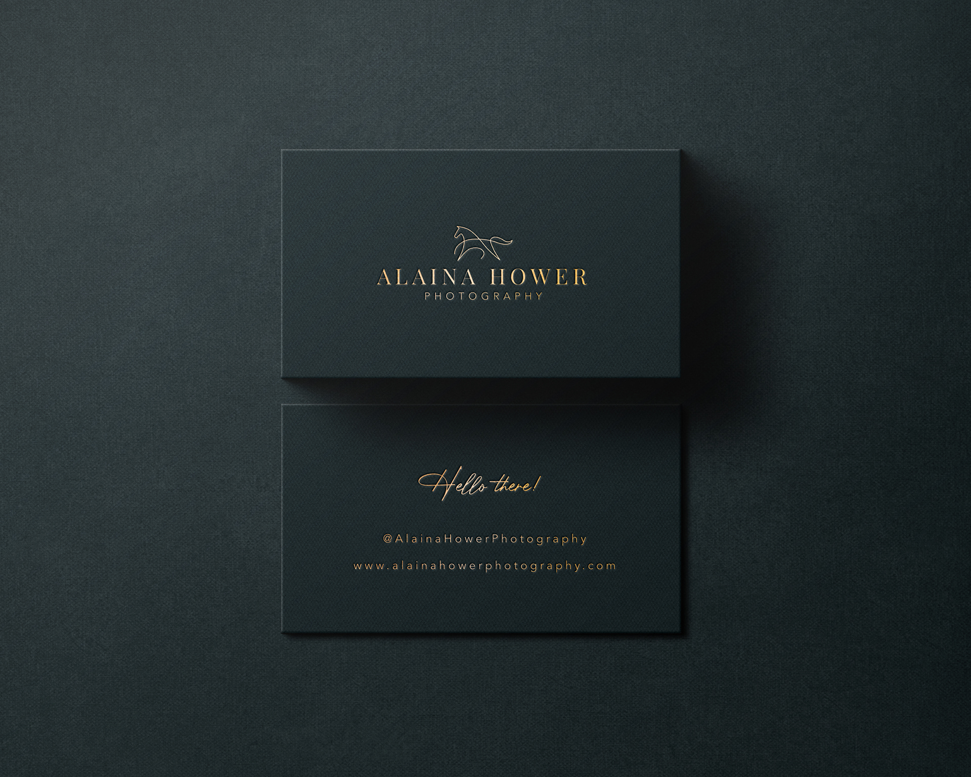
Final Design & Application
The final logo is a continuous line—a horse in motion—symbolizing the way I capture fleeting moments of beauty through photography. The embedded initials make it personal, while the minimal style ensures it remains versatile across branding, from watermarks to business cards and digital assets.
Reflection
This project was an exercise in restraint and designing with purpose, serving as a reminder that sometimes the simplest ideas take the most refinement... also that Picasso was a talented dude.